I love a Cabot property pro shop. Like, really love them. In my opinion they are course branding, marketing, and merchandising done right. Their logos are clean, modern, recognizable, and something you actually want on your merch. I visited my third Cabot property this spring. Here are my thoughts, and fair warning, they are mixed.
Brand and Identity
Here is how Cabot branding works. Each resort gets a main logo, and each course on the property gets its own (for the most part). At Bordeaux, the main mark is the Grapes, the Chateaux Course carries a Hare, and the Vignes Course has a Corkscrew fleur-de-lis. Normally I love the course logos, sometimes even more than the main one. Here I have a few problems, so let me take them one at a time.
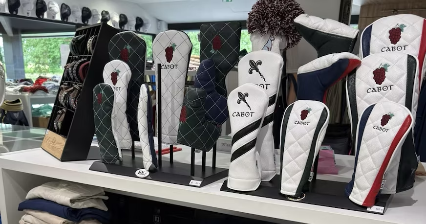
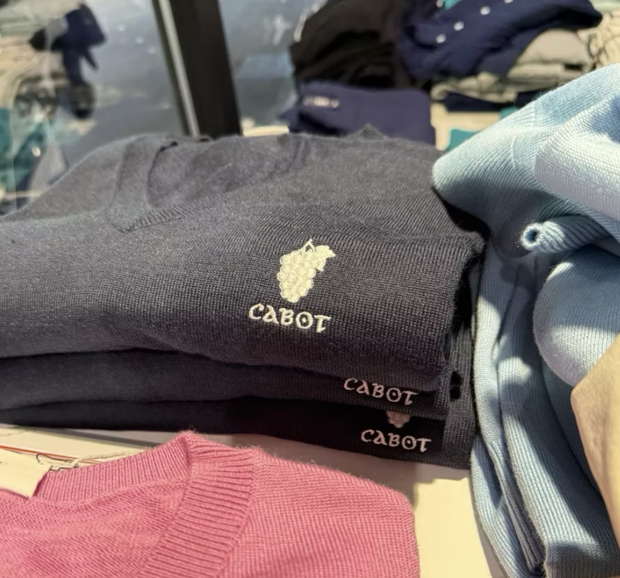
The Grapes. This is my favourite mark in all of Cabot branding right now. Mixing the Bordeaux wineries and their history with Scottish-links-style golf is chef’s kiss exceptional. It has personality, it is memorable, it represents the region, and it appeals to a broad audience. The design itself gets no notes from me.
There are literal wine bottle yardage markers on the course. Who does that!
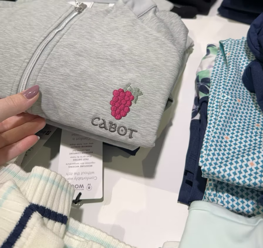
Where I was let down was the execution. Throughout the pro shop I found inconsistencies in the quality, colour, and embroidery of the logo across different items, and some pieces carried no logo at all. For a destination course that is a missed opportunity. People travel here because they love the brand or they are new to it, and if they loved the trip, they want to bring home something from the course. Not a generic adidas dress with no branding on it. I would bet that if they pulled their sales of logoed versus non-logoed merch, the numbers would convince them to put the mark on every piece.
The Hare. I like the premise, but here is where I get confused. After some research, and a conversation with the Cabot team on site, it does not seem to be a local wildlife symbol of the region. That disconnects it from the course and the brand, especially as the mark for the Chateaux Course. For a course so rooted in wine and vineyards, I would have preferred something that leans more directly into Bordeaux, wine, or the idea of a chateau as home. The Hare is also outlined in a wine colour that mirrors the Grapes, which does not sit well against the grey of the hare itself. A darker grey or black outline would have helped it stand out.
The Corkscrew. This one has a few problems. First, I did not realize it was a corkscrew. I thought it was a staff. The fleur-de-lis is a strong French symbol, though I think there are better ways to work it in. As it stands, it is not recognizable at first glance, and for Vignes I would have leaned into vines (which is the direct translation) as the symbol.
The space
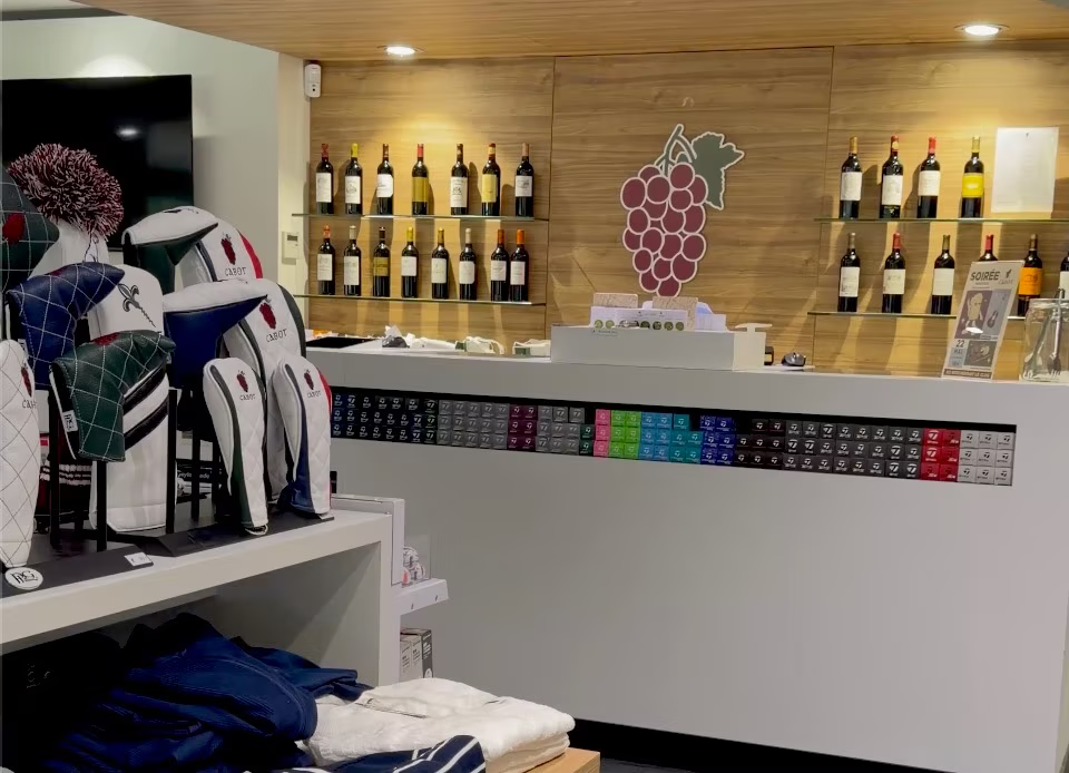
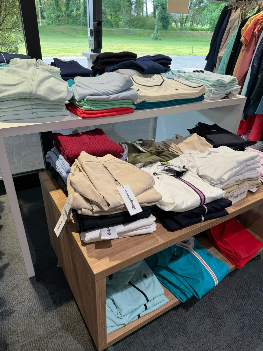
At the risk of sounding like a broken record, I have a very high opinion of the Cabot brand and their pro shops. If I did not know this was a Cabot course, I would have thought the pro shop was pretty decent. It was well lit, welcoming, clean, modern, and had a good selection. Compared with the other Cabot pro shops I have been in, the brand curation felt just ok. It lacked the popular modern brands the other stores carry (looking at you, Malbon), and the tables were a bit messy, with items stacked on top of each other so it was hard to see everything.
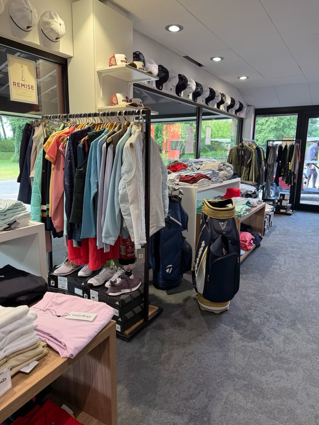
The biggest thing cheapening the brand was the clearance rack. It was literally the first thing you see when you walk in.
That is prime real estate, where you want your newest stock at full price catching the buyer’s eye on the way in.
I would move the sale rack to the back, pare back the number of brands they carry, and keep the piles neatly folded for the top-tier presentation I expect of a Cabot property.
Soft goods
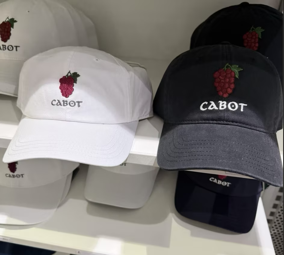
Compared with the selection at other properties, Bordeaux also fell short on soft goods. As mentioned, there are three logos, but the only one on the hats was the cornerstone Grapes. Given my comments on the other two marks, the Grapes is clearly the strongest symbol, so I understand the choice. Even so, there was a relatively small selection of hats and only a few colours.
Hard goods
I am interrupting this blog post to tell you about Cabot Citrus Farms. We made the trip to Florida early in that course’s life. Things were still being built, the course was under construction, and the pro shop had not yet brought in their personalized bag tags, a staple at Cabot courses. A few months after getting home we emailed to ask whether the bag tags were in stock. Not only were they in stock, they custom engraved ours, and mailed them to us.
Back to Bordeaux. I was disappointed to find that Cabot Bordeaux did not give you a custom bag tag with your tee time. Aside from that, the hard goods were some of the highlights of the pro shop. The bag tags, yardage book covers, divot tools, tees, and balls were really nice and on brand for a Cabot course.
The ladies section
Overall the ladies selection was solid. There was a good range of sizes, brands, and styles, and I am happy to report that I found a few things to bring home. One small nitpick: the ladies section was split into two areas of the shop, which made the section at the back easy to miss. That is an uncommon practice in pro shops, and splitting the store evenly between men’s and women’s would improve the visibility of those items.
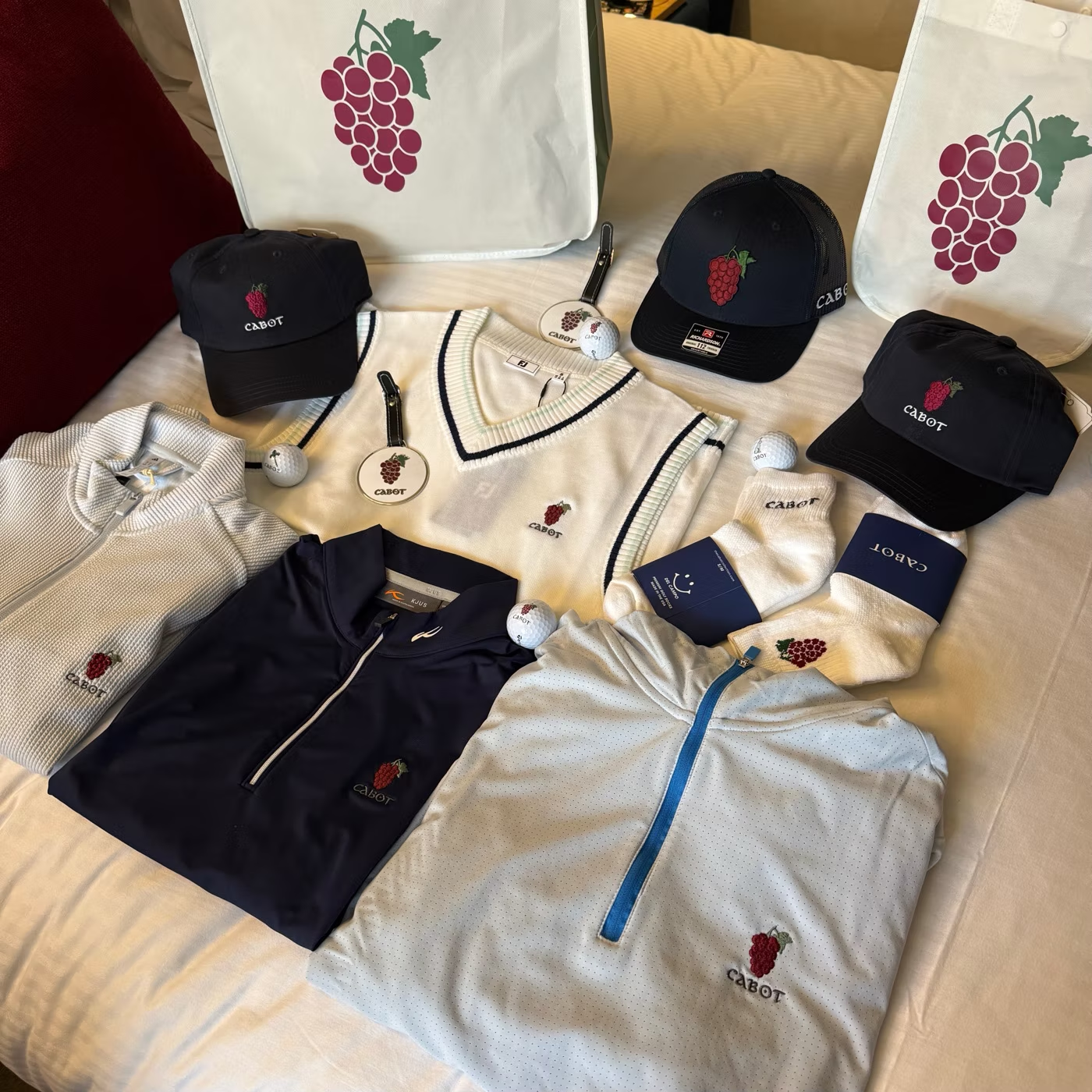
You should always stock ladies-fit hats. 55% of women golfers buy apparel regularly, yet only 21% buy it from a pro shop. That gap is revenue walking out the door, and an empty hat rack is the easiest way to widen it (espeically when you already have the hats online).
Online store
One of my favourite parts of the Cabot brand is their online store. You can customize whatever logo you want on almost every product variation. It is good enough that I actually prefer buying my course merch online before a trip, for the selection and the convenience. The online store carries more brands and options than some of the pro shops, and their customer service is top notch if you have a question or an issue with a product.
Final Thoughts
I hold Cabot to a high bar, and that is the whole point.
When a brand is this good, the gaps show up sharper than they would anywhere else.
The foundation here is excellent. The Grapes are arguably the strongest mark in the entire Cabot portfolio and the bones of the shop are all there in the lighting and layout. What’s missing is the execution. Consistent branding on every piece, tighter merchandising, and a bag tag with your tee time. None of these are hard fixes, and all of them are the difference between a good pro shop and an unmistakably Cabot one.
Would I go back? Without question. I just want the shop to catch up to the course.
New logbook entries, right to your inbox.
You're in — new entries will land in your inbox.